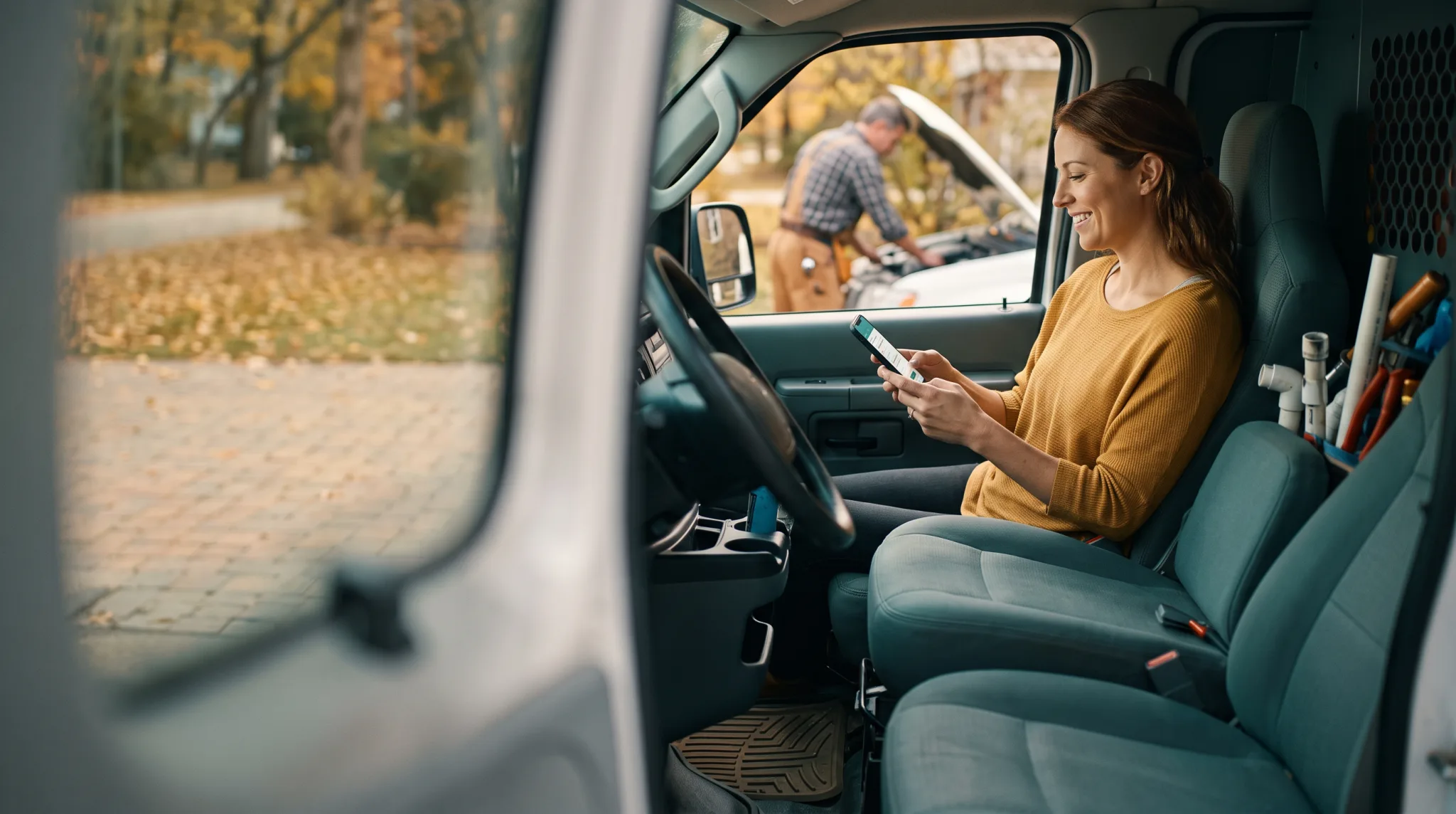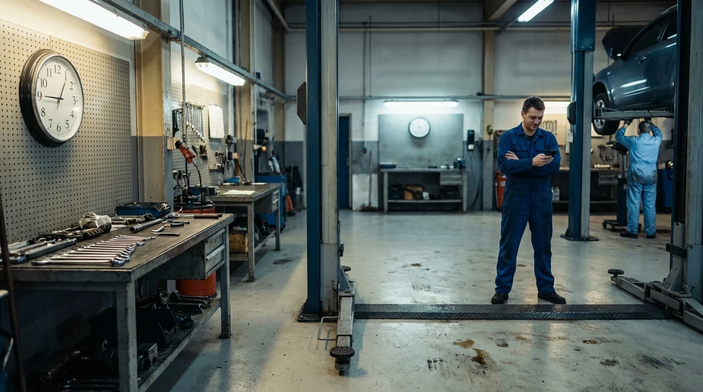


A homeowner’s furnace dies at 9 p.m. on a Tuesday. She doesn’t open a laptop. She pulls out her phone, thumbs “furnace repair near me,” and taps the first map pin that looks legitimate. If that business’s site takes six seconds to load, or the phone number is buried in a footer she has to pinch and zoom to find, she’s already scrolled past it to the next result. This is the moment that decides who gets the job, and it happens in under thirty seconds. A mobile friendly website local business owners can point to with confidence wins that moment. Everyone else loses it silently, with no error message and no complaint. Just a closed tab.
How Local Customers Actually Search and Decide on Their Phones
The path from problem to phone call is short and unforgiving. Search, glance at the map, tap a pin, skim a site for ten seconds, then call or book. There’s no browsing session, no “I’ll come back to this later.” A cracked windshield or a leaking water heater doesn’t wait for the desktop.
The Map Pin Is the New Storefront
Google Maps results load before most websites finish rendering. For a lot of local searches, the pin, the star rating, and the hours are the entire first impression. A customer near Kingsville, Ontario searching for an auto shop mid-afternoon is deciding based on what fits in that small card: is it open, is it close, does it look trustworthy. The website only matters to the customer who taps through, and by then the bar for staying is already high.
The Four-Second Glance
Once someone lands on a site from their phone, they’re not reading. They’re scanning for three things: what you do, whether you serve their area, and how to reach you right now. If those answers aren’t visible without scrolling twice, most people bail. A mobile optimization pass that puts the phone number and service area above the fold does more for conversions than a page of polished copy nobody reads.
Trust Gets Decided Fast
A slow-loading, hard-to-tap site reads as a warning sign, even if the work behind it is excellent. Customers assume a business that can’t manage its own front door won’t manage their furnace, their brakes, or their roof either. The competitor with a clean, fast, mobile friendly website local business search turns up next gets the benefit of that doubt instead.
The Mobile Essentials Your Site Needs to Have Right Now
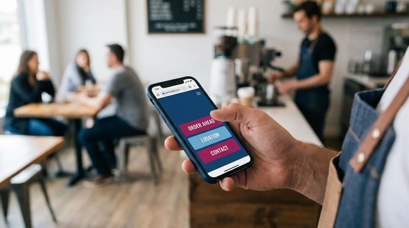
A mobile friendly website local business owners can actually rely on comes down to a short list of hard requirements, not a design opinion. Miss one and the four-second glance turns into a bounce.
Load Speed That Doesn’t Test Patience
Anything past two or three seconds on a phone connection loses people before your homepage finishes painting. Heavy background videos, uncompressed photos, and stacked plugins are the usual culprits. Strip them down and the site earns the extra second a customer actually gives it.
Thumb-Friendly Layout
A phone is held in one hand and read with a thumb, not a mouse. Menus that require pinching, sideways scrolling, or hunting through a hidden hamburger for the phone number are asking too much of a driver pulled over on the shoulder. Stack content in a single column and keep the path to contact information straight down the page.
Readable Type Without Pinching
Body text under 16 pixels forces a zoom, and a zoomed page breaks the layout customers were just scanning. Set type large enough to read at arm’s length in bright sun, which is exactly where a contractor in Kingsville, Ontario and the Windsor-Essex Region gets found on a job site.
Tap Targets Sized for Real Fingers
Buttons and links need real space around them, roughly the size of a fingertip, with room between them so a shaky tap on a moving vehicle doesn’t hit the wrong element. A phone number that looks clickable but isn’t costs a call every time someone tries it and gives up.
Why Mobile First Small Business Thinking Beats a ‘Responsive’ Afterthought
Most local sites still get built desktop-first, then squeezed down until they technically fit on a phone. That squeeze is what “responsive” usually means in practice: the same content, the same order of priorities, shrunk until it stops overflowing. It works as a technical fix. It rarely works as a customer experience.
Retrofitting Answers the Wrong Question First
A desktop-first build starts by asking what looks good on a big screen: hero image, navigation bar, a wall of services down the page. The phone version inherits that hierarchy and just compresses it. The call button, the booking link, the thing a customer actually came for, gets buried under decisions that made sense for a mouse and a monitor.
Building From the Constraint Up
A mobile friendly website local business owners can hand to a nervous customer starts from the opposite direction. It asks what a person standing in a driveway with a cracked windshield or a dead furnace needs in the first four seconds, then builds the rest of the site around answering that. The phone number moves to the top. The service area gets stated plainly. Everything else waits its turn.
That ordering is the real shift mobile first small business thinking makes. It is not a smaller version of the same site. It is a different set of priorities, decided in the order a phone user actually experiences them, with the desktop layout treated as the secondary view instead of the original. Businesses across Kingsville, Ontario and the Windsor-Essex Region compete for the same handful of seconds on a screen the size of a wallet. The ones who design for that screen first tend to win the click before the ones who merely survive it.
Click to Call: Turning a Glance Into a Conversation
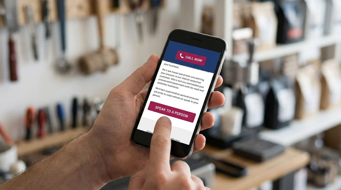
A prospect scrolling on their phone rarely wants to read another paragraph. They want to talk to someone. Click to call is the bridge between that impulse and an actual conversation, and most local sites bury it under logos, sliders, and a menu icon.
Placement That Matches Urgency
The phone number belongs in two places without fail: pinned in the header so it travels with the scroll, and repeated as a full-width button right after the first screen of content. Not a text link. A tappable button, thumb-sized, coloured to stand out from everything around it. If someone has to pinch and zoom to find your number, they will call the next business instead.
One Tap, No Detours
Every phone number on a mobile friendly website local business owners rely on needs the tel: link coded properly, so tapping it opens the dialer immediately. No copying digits. No switching apps to find a keyboard. Test this yourself, on your own phone, on your own site, right now. A surprising number of local sites fail this basic check.
Tracking What the Button Actually Does
A click to call button is worthless as a business decision if you cannot see it working. Call tracking numbers, or even simple event tracking through your analytics, tell you how many taps turned into calls, and which pages produced them. Without that data, you are guessing whether your homepage or your service page is doing the heavy lifting.
Get the placement, the link, and the tracking right, and a glance at a screen turns into a ringing phone. Get any one of them wrong, and that same glance turns into a closed tab.
Online Booking: Letting Customers Say Yes Without Waiting for a Callback
Click to call wins the customer who wants to talk right now. Online booking wins the customer who doesn’t, and that second group is bigger than most owners think.
The Job That Books Itself at 10 PM
A mobile detailing operator working out of Leamington had a simple problem: most of her inquiries came in after 9 PM, when nobody books, when phones ring to voicemail. She added online booking to her site, a real-time calendar tied to her actual schedule. Customers pick a slot, put down a card, done. No callback, no waiting for morning, no chance to lose interest and book the next name that shows up on the phone.
Within a season, roughly a third of her new bookings landed outside business hours. Those weren’t jobs she used to get slowly. They were jobs she used to lose outright, to whichever competitor answered first the next morning.
Friction Kills Decisions Fast
A prospect who has decided to book is in a narrow window of motivation. Ask them to fill out a contact form and wait for a reply, and that window closes. Online booking removes the wait entirely: pick a time, confirm, get a text reminder. The decision and the commitment happen in the same sixty seconds.
What This Costs You If You Skip It
Every service business in Kingsville, Ontario and the Windsor-Essex Region that still routes every request through a phone call during business hours is quietly capping its own lead volume. Online booking doesn’t replace the phone. It catches everyone the phone misses, and hands you a full calendar without a single callback.
Running Your Own Mobile Audit This Week
You don’t need a developer to find out where your mobile friendly website is losing local business. You need your own phone, a stopwatch, and thirty honest minutes.
Time the Load, Twice
Turn off Wi-Fi. Load your homepage on cell data, the way most customers actually find you. Count the seconds until it’s usable, not just visible. Do it again from a service page, since that’s often where the first click actually lands.
Follow the Thumb, Not the Eye
Hold the phone one-handed. Can you reach the phone number without stretching? Is the booking button visible without scrolling past a paragraph about your company history? If you’re hunting for either, so is everyone else.
Run the Real Transaction
Tap click-to-call. Confirm the dialer opens with the right number, not a dead link. Then start a booking and actually finish it: pick a slot, enter fake details, get to the confirmation screen. Note every extra tap, every field that made you think twice.
Check It on a Bad Phone
Borrow an older Android from a family member. What looks fine on your new phone often breaks on the hardware half your customers in Kingsville, Ontario and the Windsor-Essex Region are still carrying.
Write down the three worst moments from that walkthrough. Fix those first.
Key Takeaways
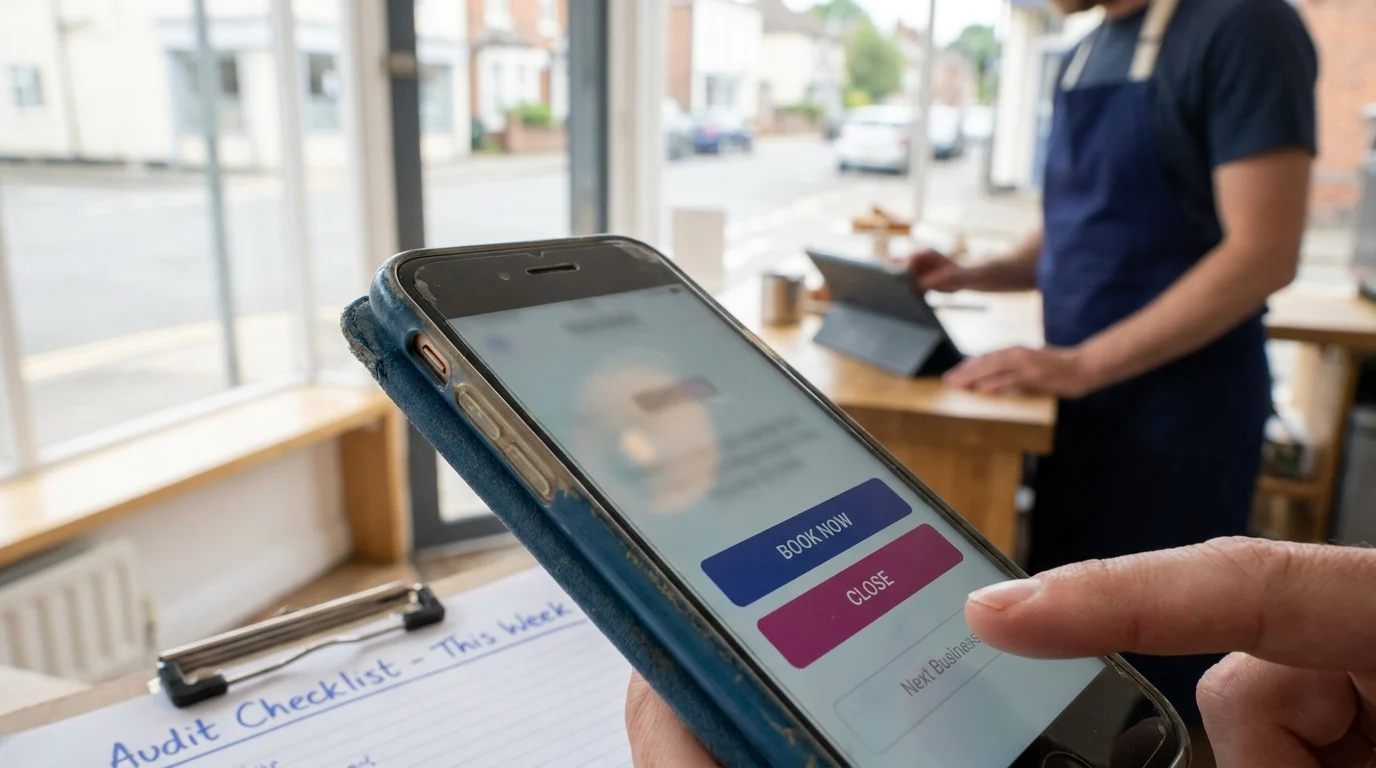
Mobile optimization isn’t a design preference, it’s the difference between a customer who books and a customer who moves to the next name on the list. The businesses winning phone traffic in this region aren’t necessarily better, they’re just easier to say yes to from a moving thumb. Run the audit above this week, not someday. The gaps it uncovers are exactly the ones costing you jobs right now, quietly, one skipped tap at a time.
Want this fitted rather than figured out? Doorways Into Your Business helps owner-operators put systems like this in place. Book a free consultation.
Paul Hughes founded Doorways Into Your Business after more than five decades consulting across 30+ countries, from implementing early IBM email systems in the 1980s to running multi-million-dollar IT projects for global organizations. A St. Clair College graduate (1976), he settled in Kingsville, Ontario in 2019 to help local small businesses grow with practical “smart digital doorways”, websites, customer service, reviews, bookings, and payments, matched to what a business needs, not unnecessary technology.
All articles by Paul →