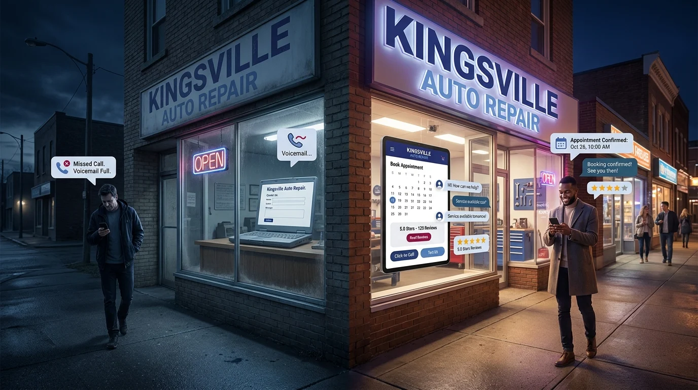

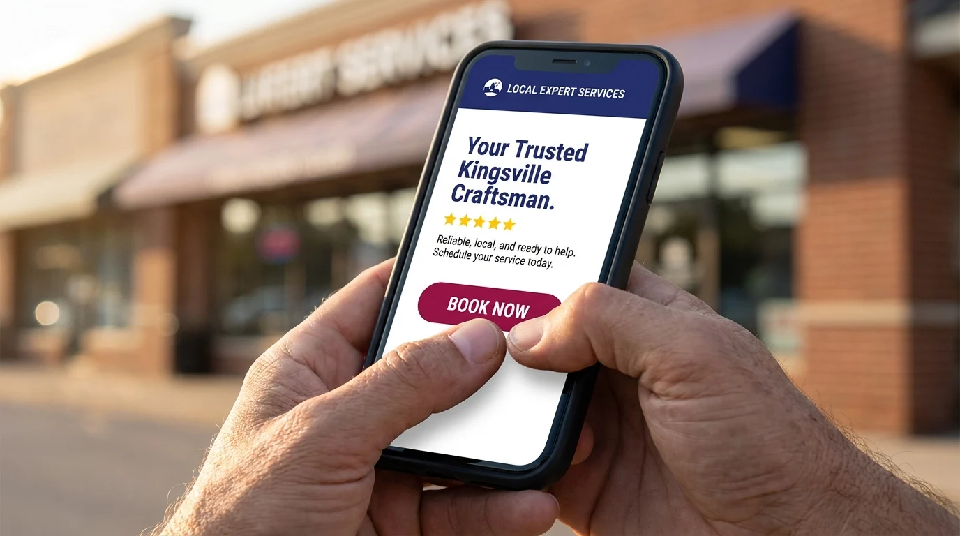
A visitor lands on your homepage, and before a single word registers, they’ve already made three decisions: is this legitimate, is this relevant to what I need, and what do I do next. That judgment happens in about 50 milliseconds, according to research on website first impressions, and it happens whether the visitor is scrolling on a phone at a red light or browsing on a laptop during lunch. For small business owners, this is the uncomfortable truth behind homepage best practices: the homepage isn’t a brochure. It’s a bouncer deciding who gets in. Get the first 10 seconds wrong, and nothing else on the page matters, because nobody sticks around to read it.
What Visitors Decide Before They Ever Read a Word
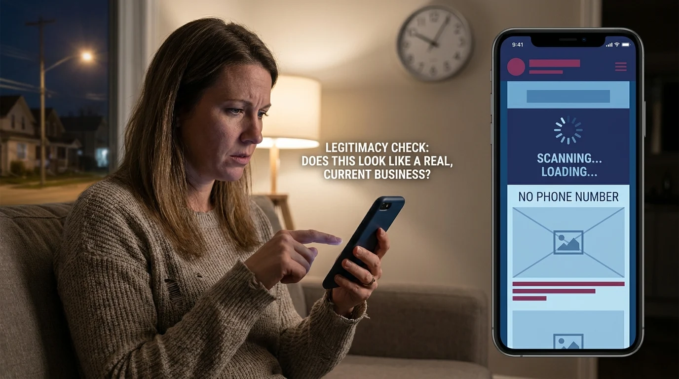
Picture a homeowner in Leamington searching for an emergency plumber at 9 p.m. She taps the first result, and the site takes four seconds to load, the layout is cramped, and there’s no phone number above the fold. She hits back and clicks the next listing instead. That whole interaction took under 15 seconds, and the first business never had a real chance. This is the reality of small business homepage essentials: visitors aren’t reading, they’re scanning for permission to trust you.
The Legitimacy Check
Visitors subconsciously ask: does this look like a real, current business? A dated design, broken images, or a stock photo that screams template all signal risk. Legitimacy is judged visually long before anyone reads the About page.
The Relevance Check
Next comes relevance. Does this business do what I need, in my area, right now? If a visitor has to hunt for that answer, they assume the answer is no and move on to a competitor who made it obvious.
The Next-Step Check
Finally, visitors look for a clear action: call, book, buy. No obvious next step reads as a dead end, and dead ends get abandoned. That plumber lost the Leamington homeowner not on price or reputation, but on those three silent checks, sealed in seconds.
The 5 Small Business Homepage Essentials That Earn the Next Click
Passing those three silent checks isn’t luck. It comes down to five small business homepage essentials working together.
1. A Clear Identity Statement
Say what you do and who you do it for in one sentence, visible without scrolling. No taglines that require decoding.
2. Visible Proof of Trust
Reviews, real photos, years in business, or licensing details signal you’re legitimate before anyone reads further.
3. One Obvious Next Action
A single, unmistakable button, whether it’s “Call Now,” “Book Online,” or “Get a Quote,” removes the guesswork that sends visitors elsewhere.
4. A Mobile-Ready Layout
Buttons sized for thumbs, text readable without pinching, and no desktop-only menus hiding the phone number.
5. Fast Load, No Clutter
Every extra second and unnecessary pop-up is a chance for someone to hit back.
A Kingsville, Ontario landscaping company gets this right: the homepage opens with “Residential Landscaping in Kingsville and Windsor-Essex,” a strip of Google reviews sits just below it, and a bright “Request a Free Quote” button anchors the top of the screen on both desktop and mobile. There’s no slideshow, no autoplay video, nothing slowing it down. A visitor comparing three landscapers in a hurry lands there and immediately knows what the business does, that it’s trusted, and what to click. That’s what small business homepage essentials look like in practice, not decoration, just clarity working fast.
Mobile-First Reality: Where Windsor-Essex Customers Actually Look First
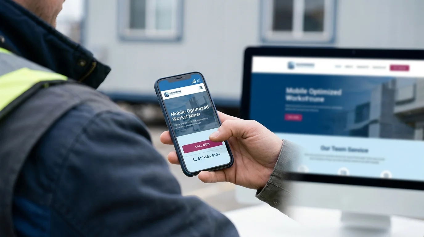
Most of that ten-second judgment happens on a phone, one thumb scrolling, cell signal fluctuating between two and three bars in a parking lot or on a job site. A homepage that looks sharp on a 27-inch monitor can still fail the exact people it needs most.
Thumb-Reachable Buttons
The call-to-action button belongs in the bottom half of the screen, where a thumb naturally rests, not tucked into a top corner that requires a stretch or a second hand.
Tap-to-Call, Not Copy-and-Dial
If a phone number is listed but not linked, every mobile visitor has to copy it, switch apps, and paste it manually. That friction is enough to lose the call entirely.
Readable Without Pinching
Body text under 16 pixels forces a pinch-to-zoom, and a visitor who has to zoom is already halfway to leaving. Headlines and buttons need to be legible at arm’s length, no adjustment required.
Speed on a Cellular Connection
A homepage that loads instantly on office wifi can crawl on LTE in a rural stretch of Windsor-Essex. Large hero images and autoplay video are the usual culprits, and they cost real customers, not just page-speed scores.
The 10-Second Phone Test
Pull out a phone, switch off wifi so it’s running on cellular data, and open the business site cold. Count to ten. Is the business name and service visible? Is there a call or booking button within thumb’s reach? Did it tap on the first try? If any answer is no, that’s the fix that matters most this week.
Key Takeaways
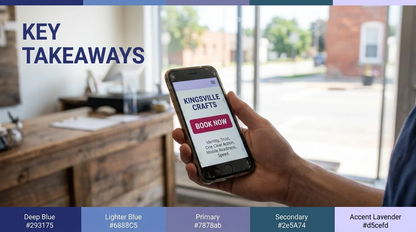
The homepage decision happens fast, and it happens on a phone more often than not. Identity, trust, one clear action, mobile readiness, and speed are the small business homepage essentials that survive that split-second judgment. None of it requires a redesign budget, just an honest look at what a visitor sees in the first ten seconds. For a business in Kingsville, Ontario and the Windsor-Essex Region, that quick phone test is the cheapest audit available, and it’s the one most owners have never actually run on their own site.
Paul Hughes founded Doorways Into Your Business after more than five decades consulting across 30+ countries, from implementing early IBM email systems in the 1980s to running multi-million-dollar IT projects for global organizations. A St. Clair College graduate (1976), he settled in Kingsville, Ontario in 2019 to help local small businesses grow with practical “smart digital doorways”, websites, customer service, reviews, bookings, and payments, matched to what a business needs, not unnecessary technology.
All articles by Paul →